
HeyKuya PH — Rebrand & App Experience Redesign
Project Type: Brand Identity, App UI, Marketing Assets
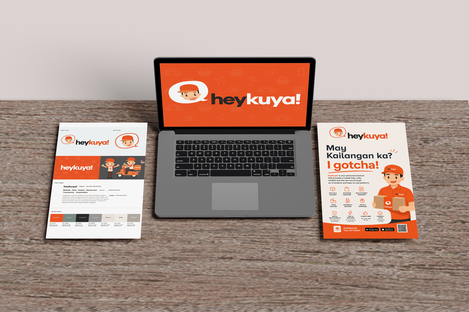
Role: Creative Direction, Branding, App Design, Collateral Design
Year: 2016
Industry: Concierge App / Lifestyle Service
Building a brand that feels as reliable as the person you call when you need help.
HEY KUYA PH was created to make everyday tasks easier through a trusted network of service providers and personal assistance solutions.
As the platform evolved, it needed a stronger brand identity that reflected reliability, accessibility, and genuine human connection while standing out in the growing service marketplace industry.
The goal was to develop a cohesive visual system that would strengthen trust, improve recognition, and create a memorable experience across every customer touchpoint.
The Challenge
HEY KUYA PH operated in a highly competitive market where trust is often the deciding factor between choosing one service provider over another.
The existing brand lacked a cohesive visual identity that could communicate professionalism while maintaining the warmth and familiarity implied by the name "Kuya."
Some key challenges included:
Limited brand recognition
Inconsistent visual communication
Difficulty communicating trust and reliability
Need for scalable marketing assets
Balancing professionalism with approachability
The challenge was to create a brand that felt dependable, friendly, and modern while remaining highly recognizable across digital platforms.

OLD BRANDING
Our Approach
We positioned HEY KUYA PH as more than a service platform.
The brand was envisioned as the dependable person people turn to when they need help, guidance, or support.
The identity was built around three core pillars:
Trust
Convenience
Human Connection
Every visual decision was designed to reinforce these values and create a brand experience that feels approachable, professional, and reliable.
Brand Direction
The visual identity combines modern technology with the warmth of Filipino hospitality.
Brand Attributes
Trustworthy
Helpful
Approachable
Reliable
Community-Driven
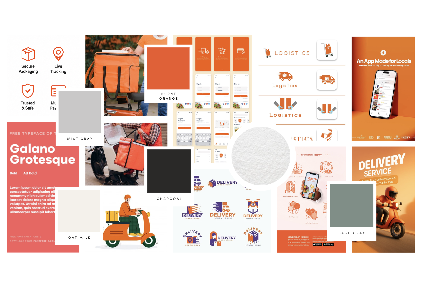
Visual Language
The brand system incorporates:
Clean and modern typography
Friendly visual elements
Strong and recognizable iconography
Accessible color palette
Flexible marketing system
The result is a visual identity that feels both professional and welcoming, creating confidence among users while remaining highly approachable.
Scope of Work
Brand Strategy
Brand Positioning
Audience Analysis
Messaging Direction
Visual Strategy
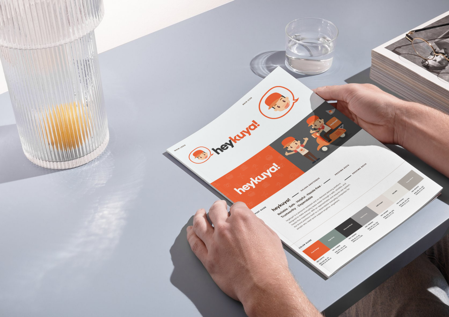
Brand Identity
Logo Design
Color System
Typography Selection
Icon Development
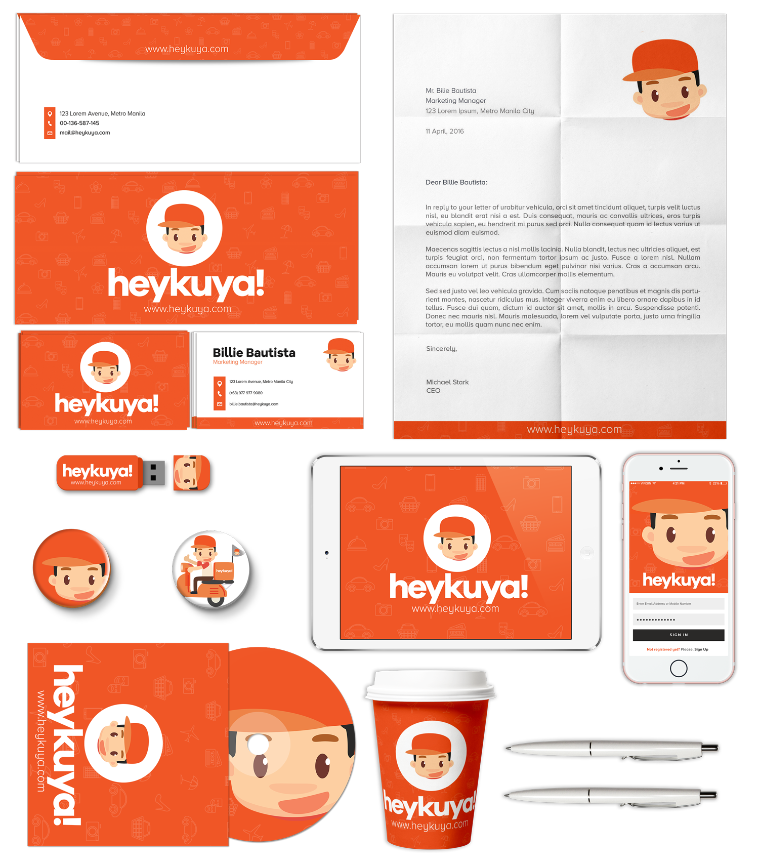
Brand Elements
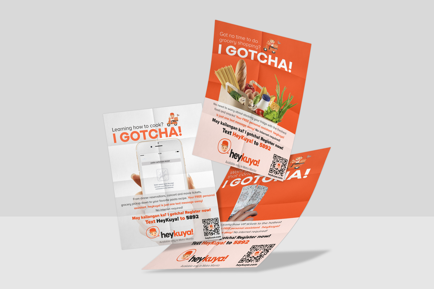
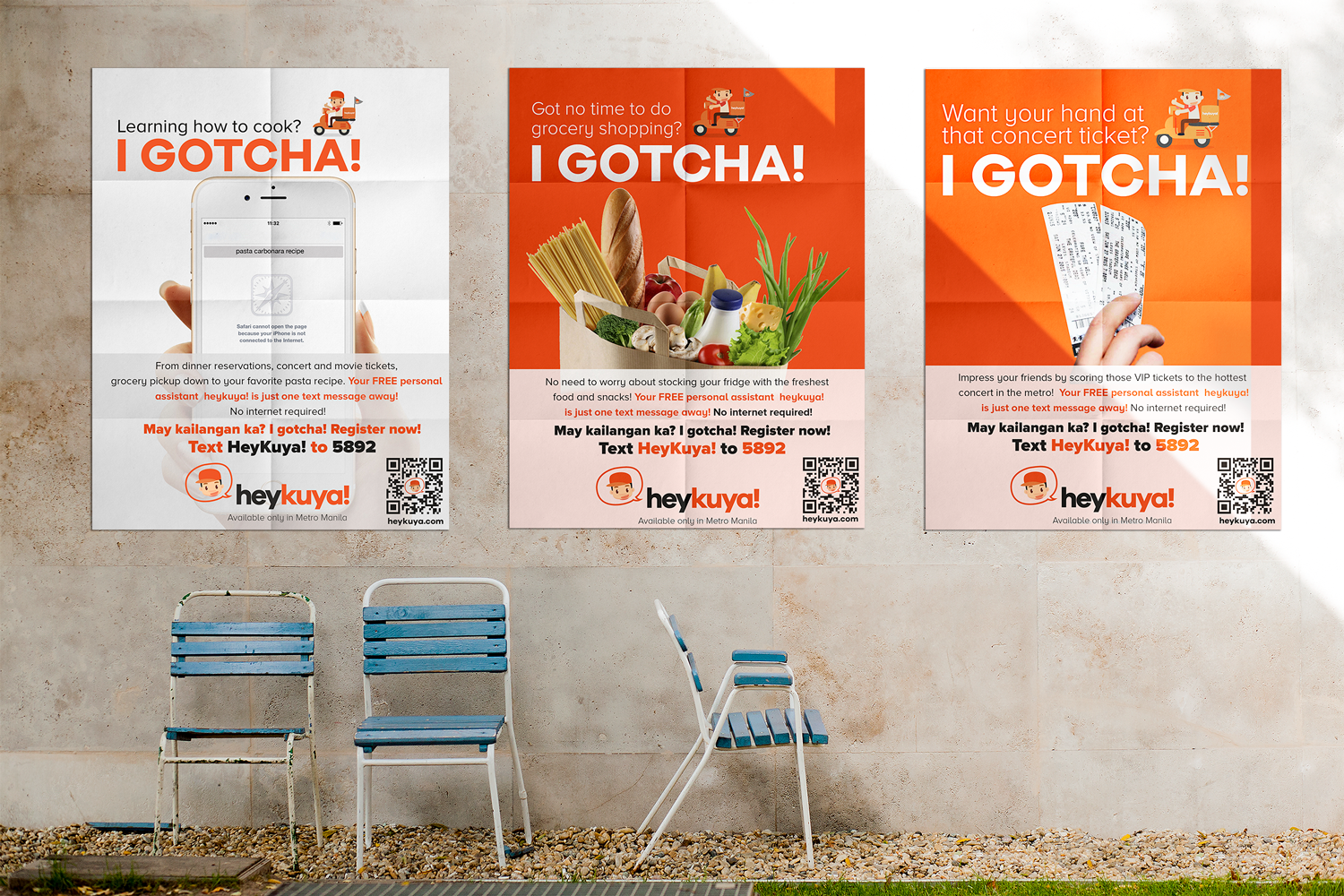
Marketing Collateral
Social Media Templates
Promotional Materials
Campaign Assets
Digital Advertising Graphics
Brand Guidelines
Logo Usage
Color Standards
Typography System
Visual Consistency Framework
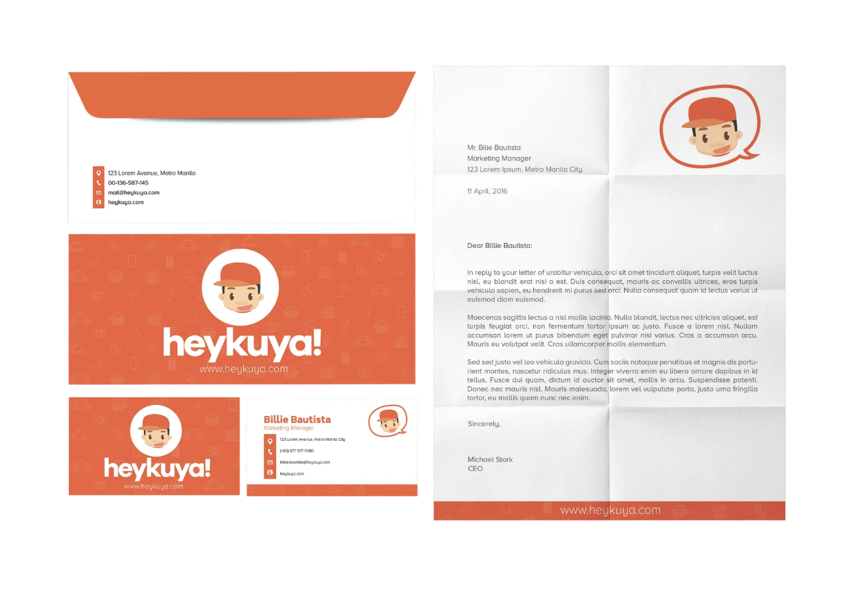
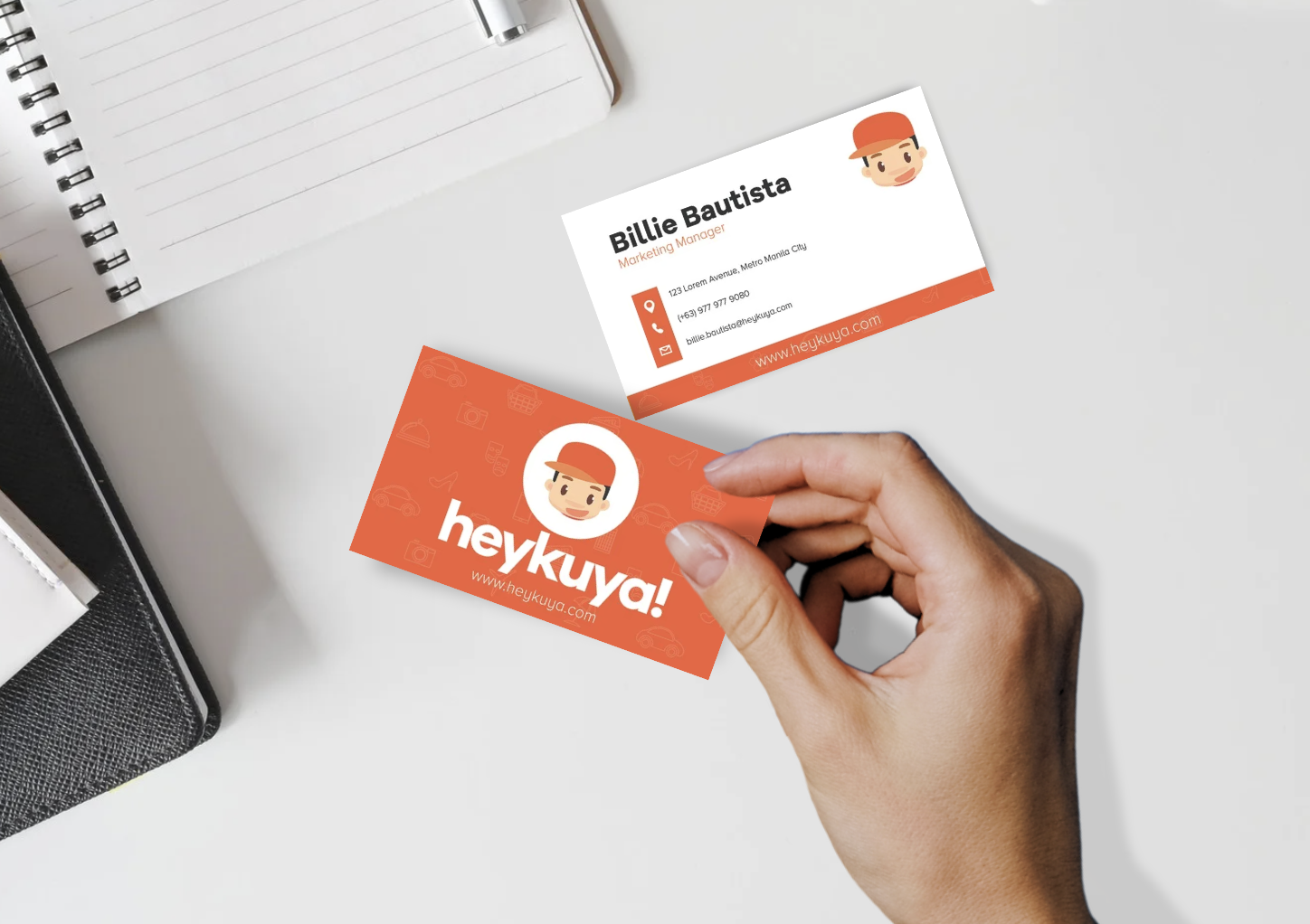
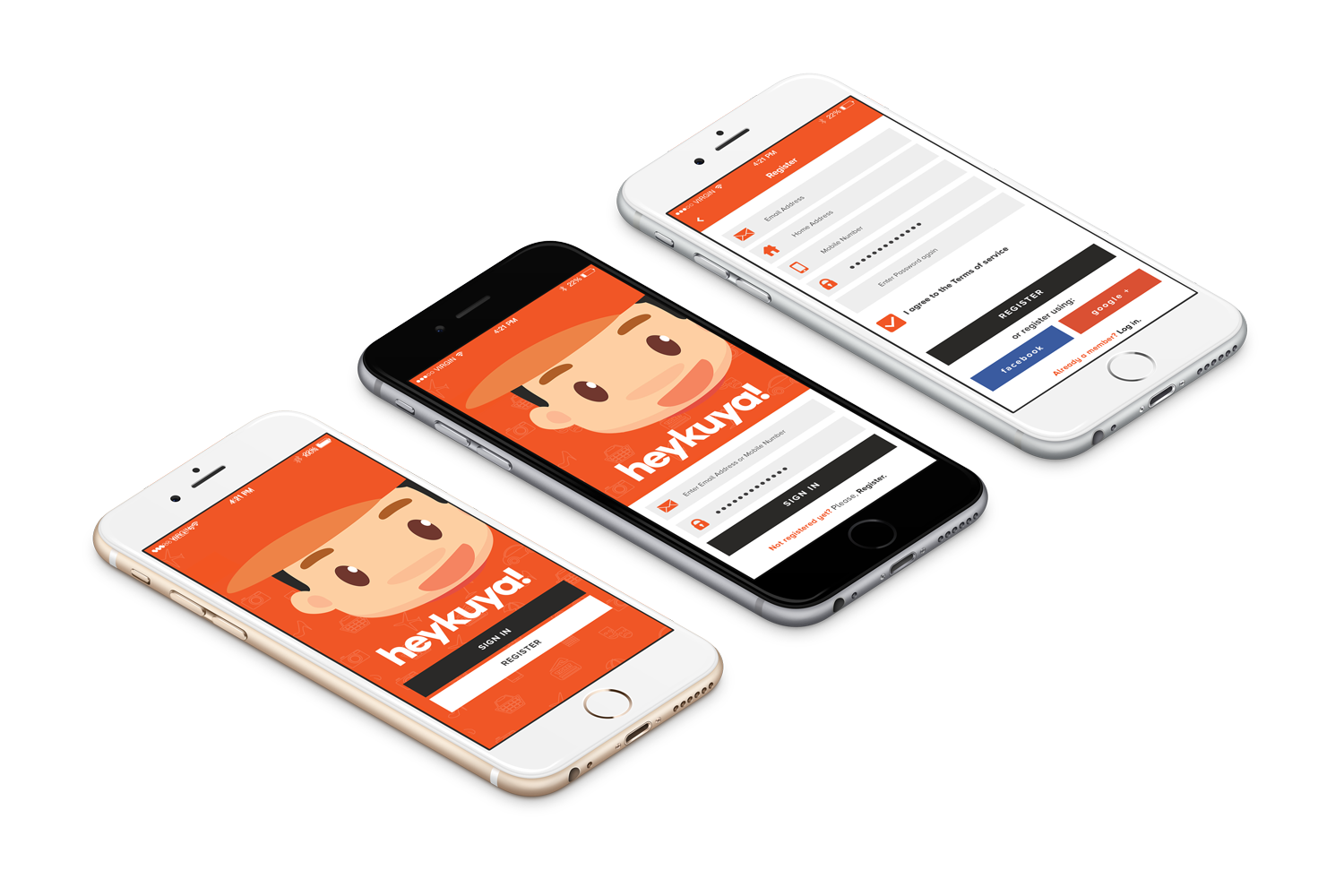
Visual Applications
*
Visual Applications *

The Outcome
The new identity provided HEY KUYA PH with a stronger and more recognizable presence in the service marketplace space.
The rebrand successfully:
Improved brand recognition
Strengthened customer trust
Increased visual consistency
Enhanced marketing effectiveness
Created a scalable foundation for future growth
Most importantly, the new brand better reflects HEY KUYA PH's mission of making everyday life easier through trusted support and reliable service.
Closing Perspective
The strongest service brands are built on trust.
For HEY KUYA PH, the goal was not simply to create a visual identity, but to create a brand experience that feels dependable, approachable, and genuinely helpful.
The resulting identity system positions the brand for long-term growth while reinforcing the values that matter most to its community: reliability, convenience, and human connection.
Brands We’ve Helped Bring to Life
-
![]()
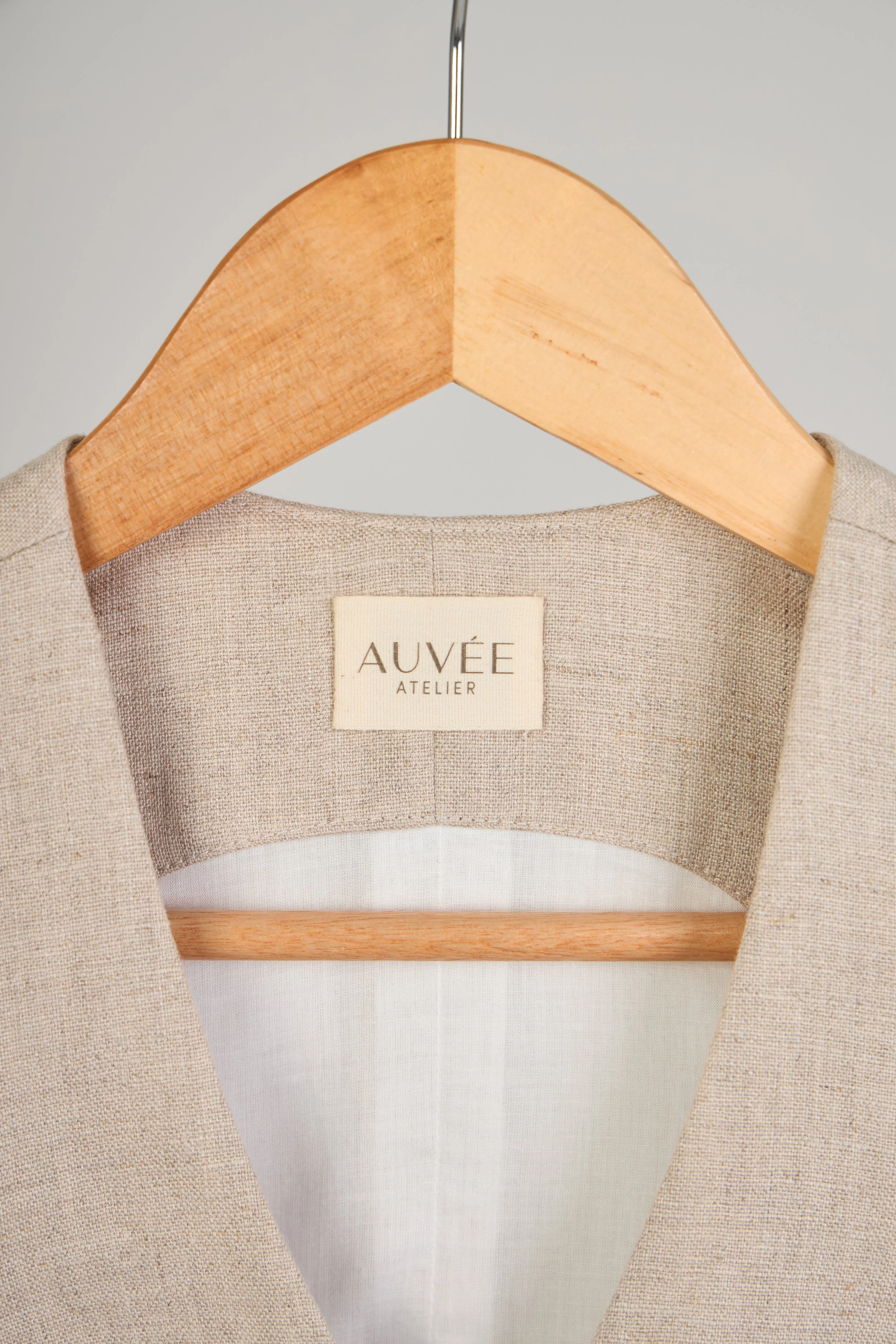
Auvee Atelier
-
![]()
Ready Maid Cleaning Services
-
![]()
Jack PH
-
![]()
Terra Tranquila Wellness